Wednesday, 3 February 2016

Paul Wright Analysis | Picture 5


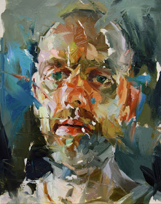
1. When I first looked at this painting, I noticed that this painting isn't as busy as some of Paul Wright's other artworks. Although there are a lot different colours and brush strokes, it is generally a lot neater. The background is pretty much one colour and the face blends in very well. The thing that first caught my attention is the use of colour in the face and how it is contrasted with the lightly coloured background. The paint looks like it has been applied very thickly, most probably with a palette knife. It is very interesting.

2. The main colours in this painting by Paul Wright are green, blue and red. There is a reoccurring similarity in all of Paul's paintings with the colours which he uses. I have noticed that one of the main colours is always red and often blue of some form. The features in this painting are much clearer than others and are all more defined. It looks as if a lot of black has also been used in this painting to show different lines in the face too.
'People want something more than just music. They don't want this bubble-coated pop stuff as much anymore. They want something real and they want to hear the artist's story.'

3. This painting looks as if it is of an elderly man, who looks quite stern. It seems like on the pictures that follows you with its eyes. They are so focused to the front that it gives the impression that it's watching you. I will use this in my own work as I think it looks really effective. I think the message it conveys is really strong and it has been reinforced by the way the photo is forward facing.


Paul Wright Analysis | Picture 4


1. My first reaction of this painting would be that I can see a lot of movement in the painting. The paint looks as if it has been applied very quickly and the movement of the palette knife looks very obvious with all of the different lines in the painting. I would say that this piece looks slightly more peaceful than some of Paul's other pictures as it is generally neater around the sides and the background doesn't really blend into the face however it is still quite busy. The colours are what first caught my attention as he has used quite a dark palette, using a lot of browns, reds and a few dark blues. The paint looks like it is very thick on the paper.


2. Above the eyes there are dark brown semi-circles which represent the eyebrows. Some of the facial features aren't so obvious like the lips. They are significantly different as they blend in with the background and if it wasn't for the darker tones under and above the lip they would be very difficult to see them. The main colours are brown, red and orange.  The order of the colours go that it is light at the top, then there are reds in the middle section then towards the bottom there are darker browns. There are also lines on the forehead which represent wrinkles/creases in his skin.


'Though I often work on a large, potentially imposing scale, the  work remains immediate through fluency of brush mark and a rich palette.'


3. As I have previously said, Paul shows emotion in his paintings. In this one, the face is either sad or angry, or maybe both. His use of colour reflects this as he has used a very dull palette. His use of browns and reds reflect the mood of the painting. The redness on the cheeks could reflect sadness, like he has been upset and his face has gone red/pink. he also has dark lines under his eyes which give the impression of eye bags, therefore he could be tired, or it could make him look more upset.


Paul Wright Analysis | Picture 3


1. My first impression of this piece of art that it is very full of life. There are a lot of different strokes of paint across the whole painting and I think that overall, it is a very busy piece of art. It does not look peaceful at all and Paul Wright has used a wide range of colours which are mainly quite dull with a few warmer colours in his face. I was first drawn to how the background colours are very different to those used in the face as it creates a strong contrast. It makes his face stand out much more as the colours are so different. Like a lot of Paul Wright's paintings, he has applied the paint very thickly and with what I would imagine being a palette knife.

2. I see in this painting that there are a lot of darker colours than some of his other paintings. The main colours are green, blue and orange/red which is mainly in his face. I see a lot of harsh shapes in the background which help to form the face. There are triangular shapes which cut into the face. Around his lips there is a dark semi-circle which represents his moustache and then the darker blue/navy colour around his chin could represent his beard.

'Whilst I appreciate the importance of the subject being recognisable, they are glimpsed rather than exposed, their inner selves hinted at but ultimately inscrutable.'


3. I think that like all of his other paintings, Paul portrays a lot of emotion. This was is a lot darker than some of his other paintings. The face itself looks very down and the features are positioned in a way that makes the figure look like it's hurting. The paintings always tell a story and it is much more than just paint on a piece of paper. The darker colours also have negative connotations. I look at the eyes in this painting and I notice that the eyes are painting green. This could have connotations that he is envious of something, which links back to the idea that Paul wright likes to convey a story/message in his paintings. Although there are different sizes of strokes, lines and textures, all of the features are quite clear and distinguishable, apart from the face which blends in the face really well. I will use this in my own work by using a variety of colours which are all quite dark and I will also try to show emotion through my artwork.


Paul Wright Analysis | Picture 2


1.When I first looked at this picture by Paul Wright, I noticed that this one seems a lot brighter than Picture 1. The colours that have been used in this painting are very similar to those in picture 1, however they are brighter and overall the piece is quite busy. There is a lot going on in terms of the colours and the amount of paint used. It looks like it has been applied very thickly (impasto) and some areas have more going on then others. My eyes were first drawn to the hair. I noticed all the different use of colour and I feel that all the different shades of brown help to create the overall effect of how the hair looks.

'The subjects retain their integrity and yet a


sense of intimacy is evoked.'


2. The main colours in this painting are yellows, pinks and browns. The mixtures of pink and yellow give the skin tone effect. The forehead is much darker than the back and the left hand side of the face has a lot of darker tones as that is where the shadow is. In the hair, you can see where he has layered different colours on top of each other as there are streaks of different colours throughout the hair. The colours are applied a lot lighter in this painting. To create curls in the hair there are some circular shapes, especially at the back. The hair looks like it is tied up in an up-do and this effect is created by the different tones and shapes.

3. I think that the artist is trying to show emotion in this painting. The way that he has positioned the figure with her head looking back gives the impression that she is looking sad. Also, the expression on her face is sadness. The left hand side of the face is really dark and disfigured which could have connotations of something that could be affected the model and which could add to why the model is looking sad and low. I wouldn't say that this piece is abstract as the colours are quite subtle however there are some sections which stand out more than others. I will imply this into my own work by experimenting with different ways of applying paint and trying to be more careless.


Tuesday, 2 February 2016

Paul Wright Analysis | Picture 1


1. When I first looked at this piece of art by Paul Wright, I thought that it looked very interesting. I first looked at the use of all the different colours, and how the paint is applied in a very impasto way. I thought at first that it had been painted using a palette knife by the way there are strokes of paint across it. It is a  very busy piece and there is lot going on  which makes the artwork come alive.

2.  The main colours in this painting are red, orange, brown and then there a highlights of purple and yellow. On the figures forehead I observed that there is a 'T' shape in white paint which adds a three dimensional effect to the painting. There is a dark semi-circle under the eye which adds depth into the picture. The figure has a tilt in the head which makes the left hand side of the painting have a darker tone as the light is more on the right side. The hair has many different shapes and colours. 

3. I will try and include the artists' style of work into my own artwork by experimenting with layering paint to create a certain look. It looks as if Paul Wright has put down a base coat on the paper then built up the colours and tones by piling on the paint. I will imply his techniques into my own artwork by trying not to be such a perfectionist of how my art looks. Paul Wright doesn't seem so bothered by the fact that his edges aren't perfectly neat and this shows in all of his paintings. I think that he tries to tell a story in all of his paintings by showing different emotions. In this piece, the figure looks happy with a head tilt which could imply that she is quite innocent. I personally find that the colours used have connotations of happiness as they are quite bright which reflects in the position of the girl and the fact that it is overall a bright, happy piece. I really like this painting as I like the originality of it. I like the use of colours and I like how it isn't just created using a paintbrush and that it was created using something more difficult.

4. The use of colour is really effective in this piece by Paul Wright.  There are sections of white paint in the picture which at as highlights,  like on the cheek and on her forehead. It also helps the  picture stand out more and makes it more three dimensional. The hair includes multiple shades of brown which adds to the overall effect of the painting. The darker colours around the eyes add more depth into the picture, making it look more realistic. Paul Wright has used quite a warm palette as the colours that he has used are very warm with a lot of oranges and reds. Quite a few secondary colours are used, as well as the primary colours. He has mainly used reds, pinks and very subtle peachy/orange colours.

5. I think that the artist created mood in this painting by the use of colour. The mood is quite happy and I think that Paul's use of lighter colours helps to reflect this. On the other hand, I think that there is an aspect of sadness in the picture as I think that the darker blue/green in the background could have negative connotations.

6. The shapes in this picture are quite harsh, meaning that they are straight and some are actually quite pointed on the edges from where the palette knife has been lifted off the paper. There are a few shapes which are slightly curved, for example around the mouth, the shapes are varied though the majority are straighter. The left cheek is more empty in terms of the amount of shapes compared to the rest of the face. I would personally say that the centre of interest is the nose as it is such a different colour to the rest of the face.

7. The medium used for this piece of art is acrylic paint. He has used this medium very generously and he hasn't held back with the amount that he used. As I previously mentioned, he has applied the paint in an impasto way. I personally think that the painting was done with quick strokes of the palette knife however I think it would've taken a while to complete the final piece.




Wednesday, 9 September 2015

Art Images


This piece of art is done by Robert Delaunay, in the medium oil paints. It is entitled Endless Rhythm and was created in 1934. I chose this as the image that I loved as I liked the originality of it. I also like it because it's quite simple but effective and I think that the usage of colours help with the effectiveness of the artwork. I have seen this piece if art multiple times and it just stands out as something I really like! The way it is practically made up from circles is what fascinates me! I find it incredible that a piece of work so simple can make such a big impact on  people, and can become so popular.


This first image is by Mark Rothko. The painting is called 'Red on Maroon' and was created in 1959. It was created with the use of oil paint, acrylic paint and glue tempera, which is a permanent, fast-drying medium. I chose this as the one painting that I don't really understand why it is art. When I first saw it, I didn't think anything of it, and for me personally, it is just a red rectangle on a canvas. I don't think that it is very eye-catching and is possibly just something that I'd walk past if I saw it! I don't think that I will ever be able to comprehend why this is deemed as art.


These are the three expressionist painting that I chose. I really like the style of expressionist paintings as I think the way the paint applied. It looks quite efforless yet the overall effect is really good. Its almost like the paint has been slapped on to create an amazing piece of work.
The first image is by Edvard Munch. The art is entitled 'The Scream' hence the face being pulled in the artwork. It was created in 1893. I like the way it swirls on the page, and even the person blends in with the way the paint has swirled. Although it is a bit distorted, you can clearly see the detail that has been put into the painting and all the different features are very clear.
The second painting is by an artist named Russ Potak. I am unaware of both the title of the piece and when it was created. I like this one because the paint, which I think is oil paints, all blends in together however at the same time is not blended too much so you can see the image.
Finally, the last image is entitled 'Starry Night' and was composed by Vincent Van Gogh in 1889. This is a very popular image in which has been seen by people multiple times. It was created with the use of oil paints on a canvas base. It is currently displayed in the Museum of Modern Art in New York. I really like this painting as I like the combination of colours that have been used. They all fit in together and create a nice blend overall!


These are the final three images that I have picked out as portraits that I really like. I think that all three of them are different and unique, as none of them are like a standard kind of portrait you might see, or that you may draw yourself!
 The first portrait I chose is by an artist called Nikos Gyftakis. It is called ' Selfportrait IX' and was created using oil pastels on a canvas base. The reason I chose this is because I really like the originality of the painting. It is of a quite distorted man, with all of the facial features being squashed up using the hands as the reason why. I love the use of colours and I feel that this could really inspire me to step out of my comfort zone and experiment with different ways of creating artwork!
The second image was composed by Nick Gentry. It is called 'Electress' and made by oil and used computer disks on wood. You could debate that this isn't an actual painting, however I really like how individual it is. I have never seen a piece of art like this one before. I really like the way that the different hard drives are able to create such an amazing piece of art, as it really adds something to the piece of art. I personally think that the background image is a painting with hard drives making up the skin tones.
Finally,  the last image is called ' Questo lato della verita' which is Italian for 'this side of the truth'. The artist who created this is called Davide Cambria and he is a self-taught artist who was born in Messina, Italy, hence the reason why the title is in Italian. Here, it looks like squares of paint have created the picture, and I could imagine it would of been done using something like a palette knife, as it looks quite textural. I like how realistic it looks despite the way in which it may of been created, it includes different tones and occasional sections of blue, which I think all together, makes the art look realistic!